Logo Design
& Visual Identity
Springfield Community Church was looking for a scaleable logo design that will stand the test of time and help communicate the purpose and heart of their church. They wanted an adaptive logo for multiple uses, sizes, and contexts that appealed to a diverse audience, and an icon that was easy to identify without the church name.


Concept
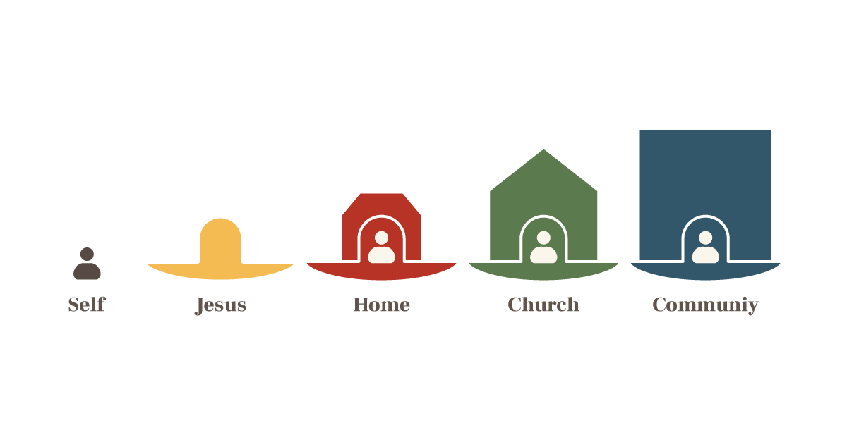
Founders of the church had a strong and established discipleship pathway that exemplified the purpose of the church and I felt could be developed into a strong logo and icon that would serve as a reminder of that cornerstone concept. The hand drawn illustration used for that concept was a little to complex and detailed to serve as the primary mark for the church. So, I spent some time simplifying the elements while trying to retain as much meaning as possible.


I opted to use geometric shapes and lines to allow the icon to be scaled very small and still maintain clarity. Each basic form was chosen to communicate meaning for the category of life it represented while maintaining some distinction when combined together.


