Gallery Church
Brand Identity & Strategy
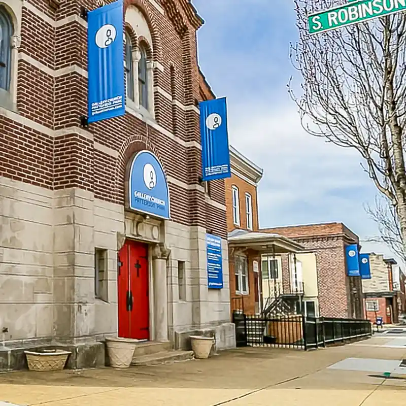
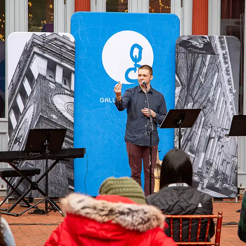
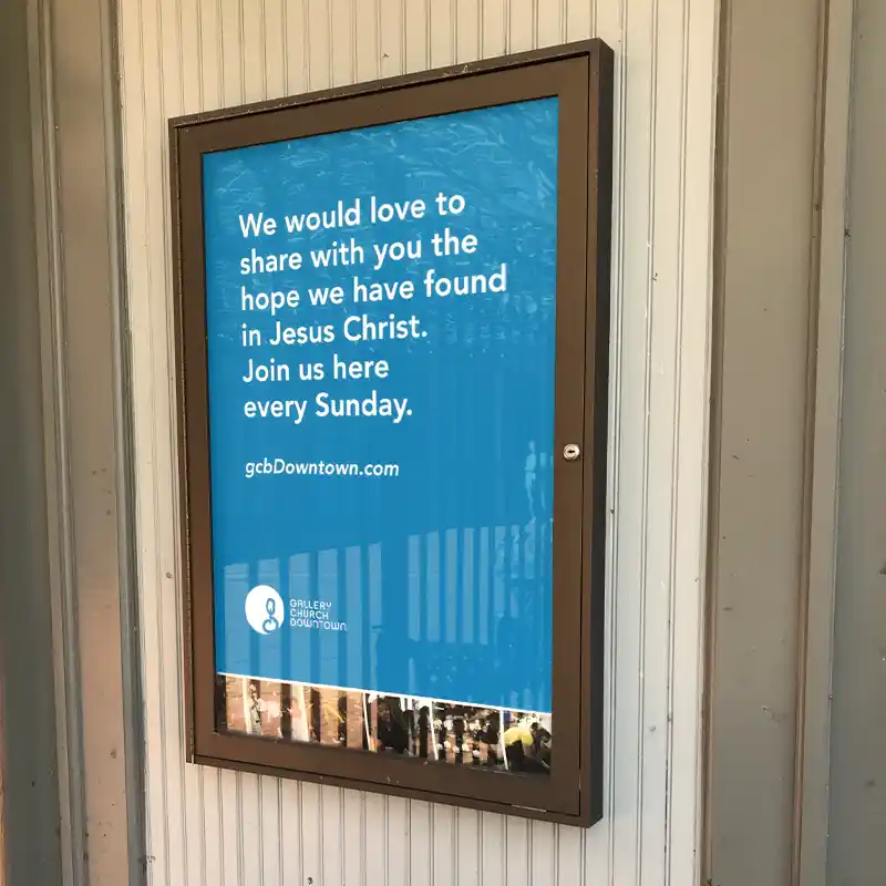
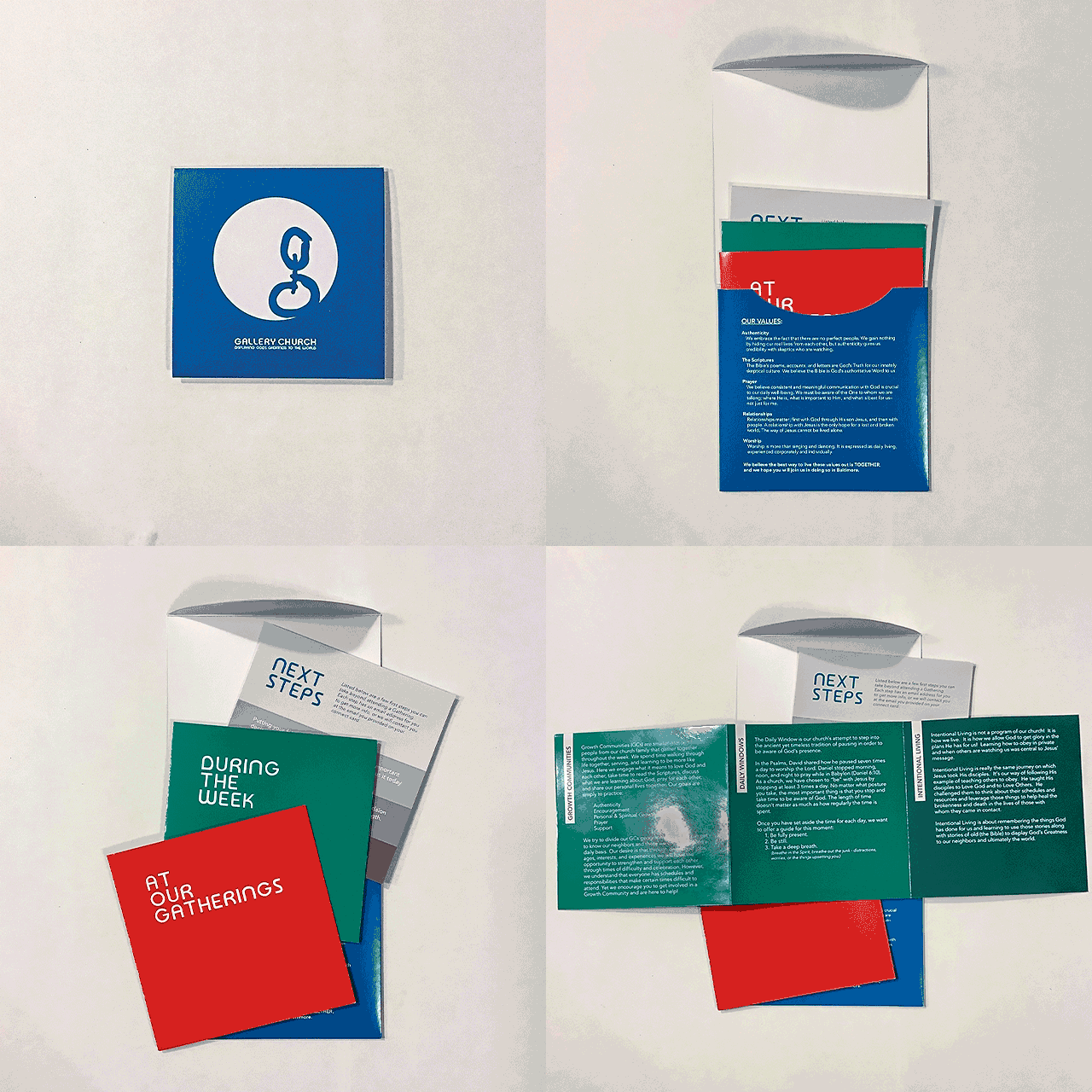
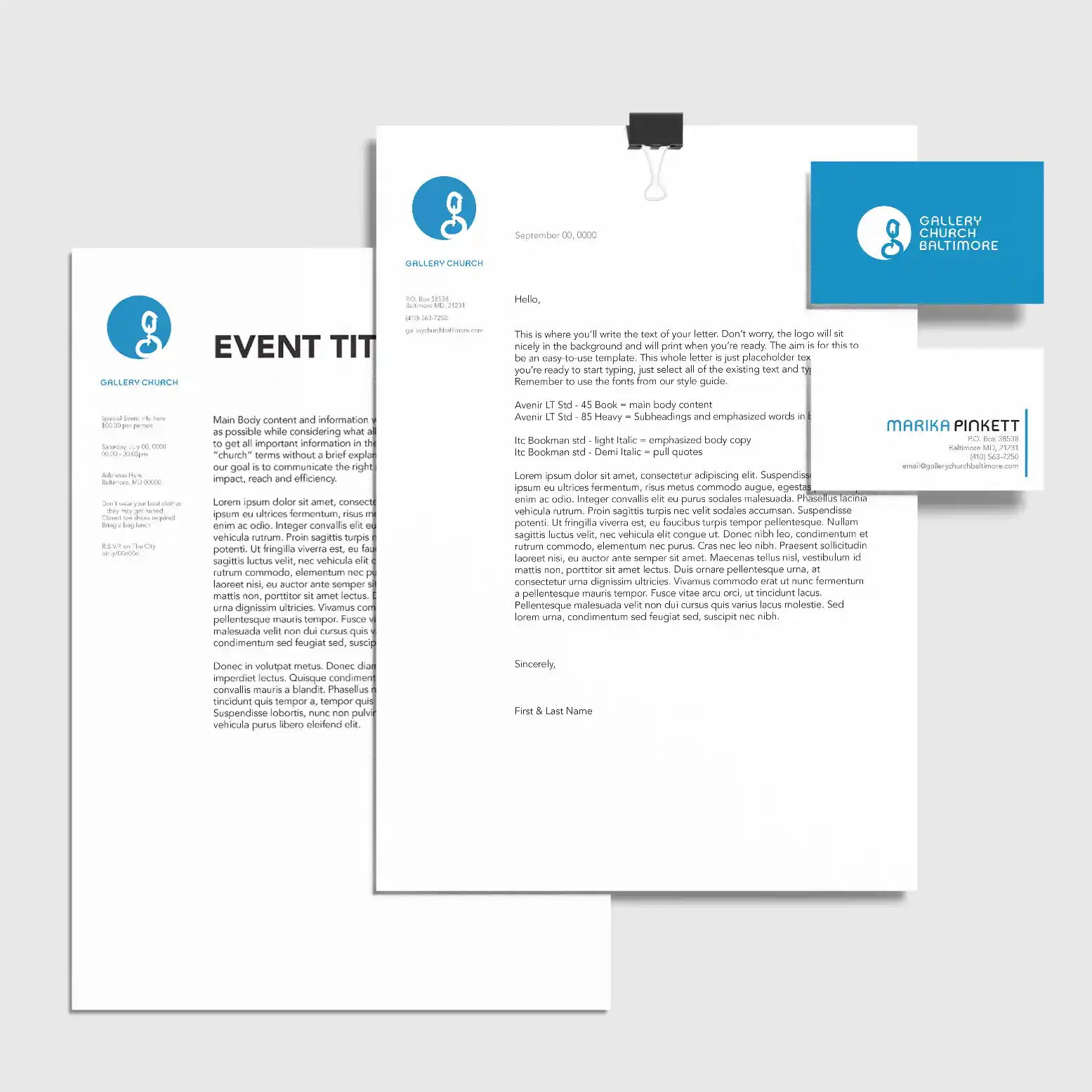
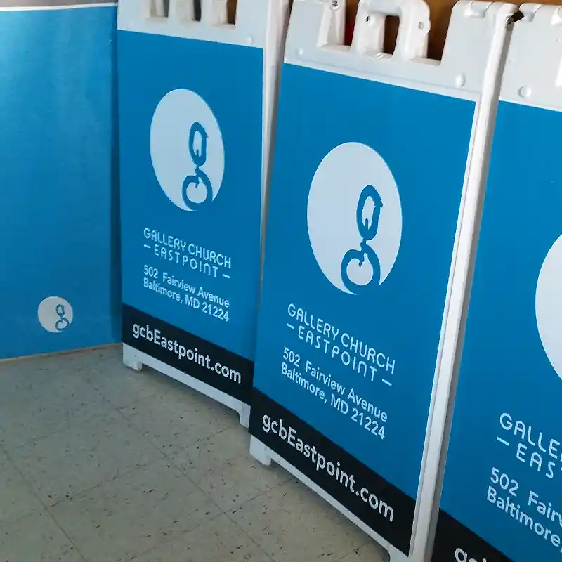
Gallery Church needed a dynamic brand identity that was versatile enough to function in multiple cultures and languages across several unique neighborhoods in Baltimore. They wanted a full branding package that included logo(s), brand strategy, guidelines, plus communications and marketing materials.
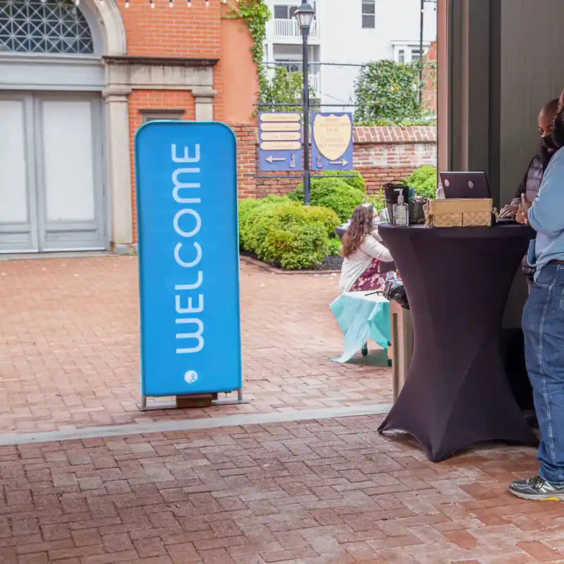
Along with a clear and understandable vision and mission statement, they also provided considerable research about the city and communities they were focusing on in the early stages of the church. We spent time talking through those notes as well as driving around the neighborhoods to observe. During the tour I tried to pay attention to signage and styles found within their target areas. The goal was to build a brand identity that felt like it belonged, but also grabbed enough attention from the various storefronts, homes, and signage that it would live within.
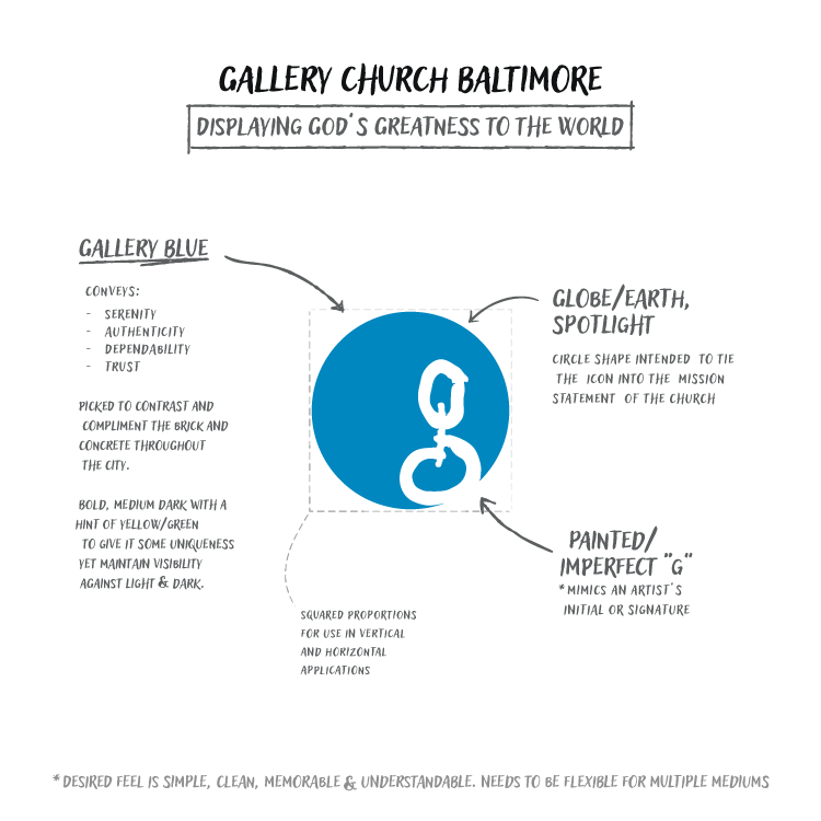
After discussing a few options we felt a primary color of a bold blue accomplished the goals and provided the meaning they wanted as a church. From there I worked through Pantone swatches using photographs in the neighborhoods to find the right balance of contrast and distinction.

Dynamic Logo System
Once we had the primary color, we started working on developing a strategic logo system for the church. One of the issues that we wanted to take into consideration was making sure people understood it was actually a church and not an art gallery. While the mission statement uses an art analogy, the church did not have plans to meet exclusively in an art space, or to start one at any point in the future.
Because of this I wanted to avoid imagery that would point someone in a gallery specific direction. The circle icon that was chosen is meant to reference a globe and a stage or art spotlight. It is subtle and modern, and very quickly allowed church attenders to connect the logo/icon to the foundational teachings/vision they learned about the church.
To match the minimal and modern feel of the icon I created a set of custom letters using the mid-century modern font Bauhaus as the foundation/inspiration.
I paired this with additional fonts for body and emphasis copy and provided a style guide to help the church’s staff and volunteers understand how they should be used.
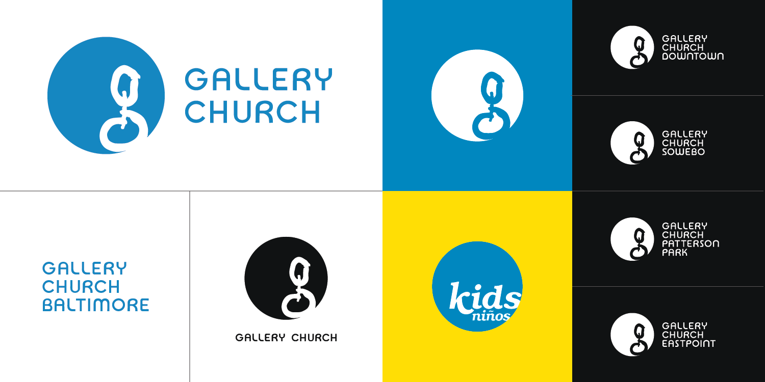
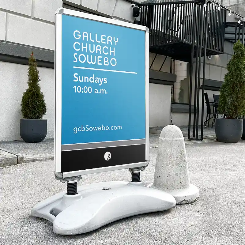
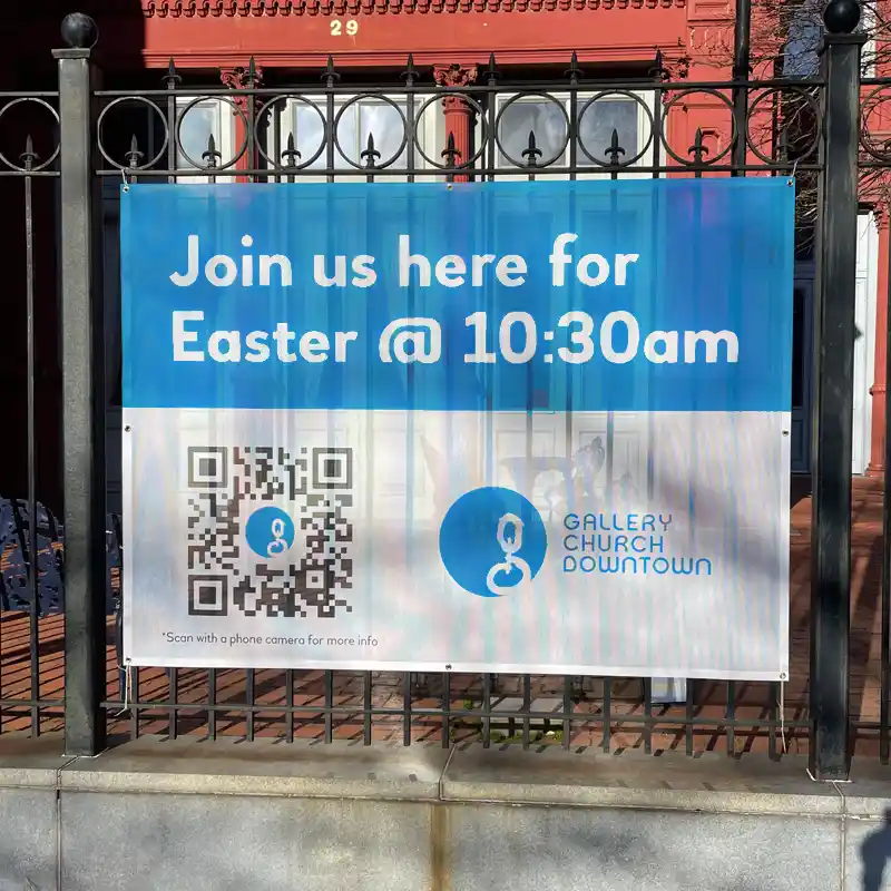
Because the church was already gathering small groups in multiple neighborhoods, they knew they needed a dynamic logo system that could expand and contract as they grew yet stay personable to the communities they were connecting with. We worked to update and expand the recognizable identity for their family name “Gallery Church” while using text to distinguish the neighborhoods the various congregations lived and met within.
The logo system included variations for vertical and horizontal applications, along with alternates for watermarks and a sub logo for their children’s programming. The comprehensive style guide also provided rules around brand voice/tone, established communication standards, and set boundaries for how the logos should be modified and shared publicly. The style guides were customized for each neighborhood and included a toolkit full of pre-made design resources and samples to work from.
