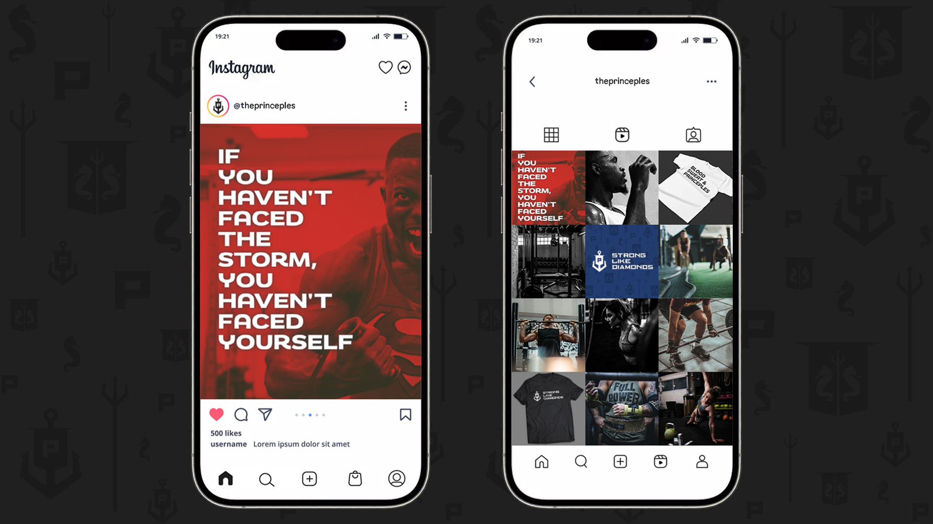
Brand Identity
& Strategy
PRINCIPLE TRAINING is a husband & wife team using their passion, experiences, and knowledge to provide customized personal training, workout plans, nutritional advice, and online accountabaility to help others achieve their health & fitness goals. They contacted me to develop a logo and brand identity to help them launch their business.
Name
Principle: (noun)
“a fundamental truth or proposition that serves as the foundation for a system of belief or behavior or for a chain of reasoning.”
The spelling of the brand name is an intentional mashup of principle and the owner’s last name “Prince.”
Mission & Vision
“Our mission is to share our principles of health and fitness through personalized training and motivational support.
Tagline
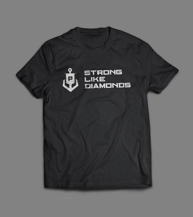
Extreme pressure and high temperatures compress carbon atoms with such force that the atoms begin to bond forming a crystalized version of the carbon we know as diamonds. Our purpose is training the body & mind to withstand the pressures of life so we become strong like diamonds.
Strategy Materials
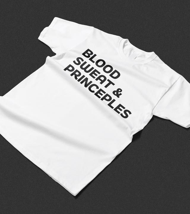
As part of the brand strategy discussion, we talked about how to incorporate the name, mission, and tagline into marketing and other communication materials. I helped research and develop a series of quotes and phrases to use in early social media materials and branded assets like shirts, posters, and brochures. We built a spreadsheet and cloud based folder to store all this material and track how it was used as they were getting started. This is their first business launch so the goal was to build an easy to travel path for keeping track of their materials and communication. The resource folder should provide plenty of steps and reference points to help them or future employees/contractors maintain brand consistency in their communications.

Logo Design
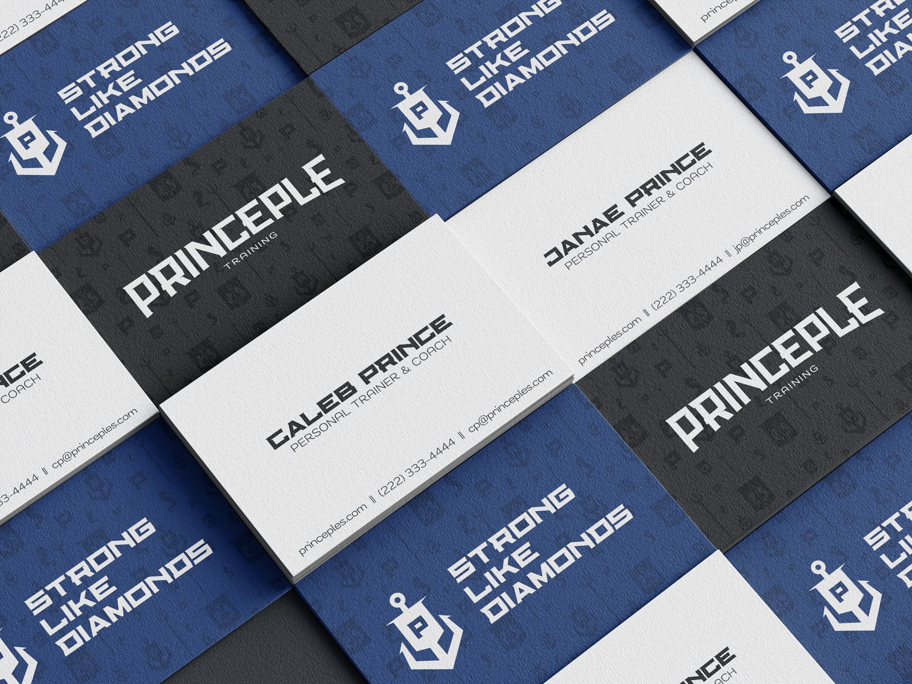
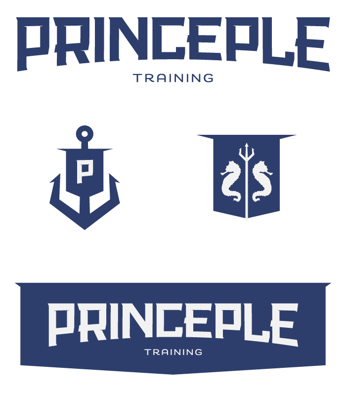
They wanted the logo to have a tough, chiseled, bold/heavy feel that connected to the gym and training industries. The goal was to keep it gender neutral but not soft, portraying strength & toughness.
Owner serves in the US Coast Guard and has a deep, life-long love for the ocean. During the research phase I studied USCG badges, shields, various pins and related iconography.
My goal was to subtly connect to these elements while maintaining respect for their distinction and purpose. Lines and corners were kept sharp and pronounced like a chiseled gemstone to connect with the diamond tagline.
Reference Elements:
Ocean theme – Boats, anchor, sails, trident, etc., “Diamond” nickname, banner, weights

Color Palette
Primary color scheme is a metallic greyscale that ranges from Black to white. The accent colors are borrowed from the U.S. Coast Guard:
Red – #e03c31
Blue – #006ba6
Type
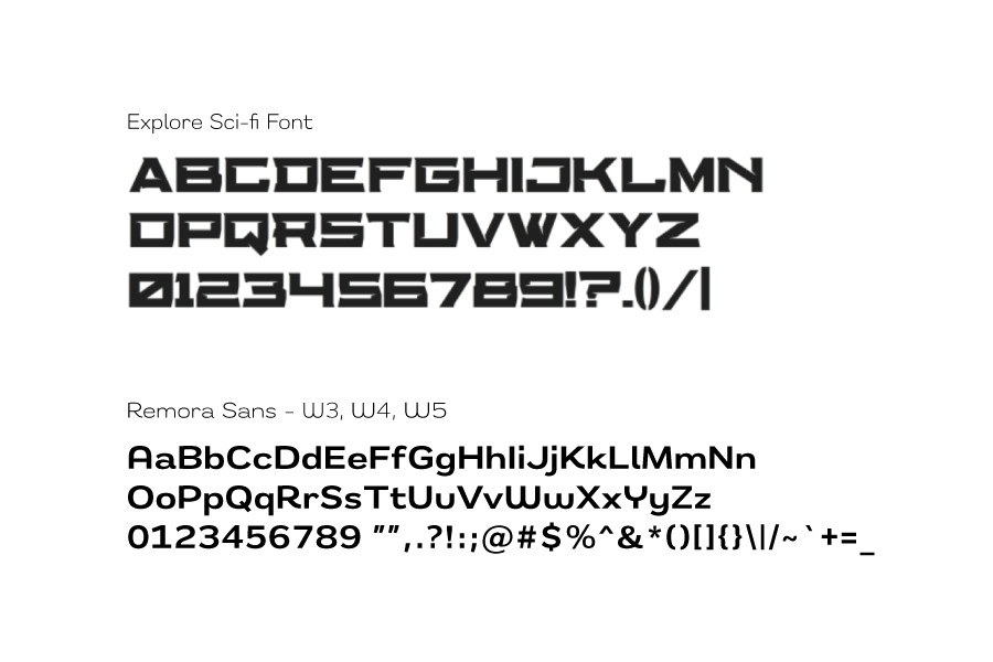
The logo type is a customized version of the Explore font by Geelator Studio. It has sharp lines with strong features and is intended for use in headlines and short phrases along with the logo icons.
I paired Explore with Remora Sans for body copy and longer sections of text where paragraphs are needed for improved legibility and adaptability like font weight and character width for emphasis.
Photography
As part of the Brand Identity I helped define the brand voice beyond the copy and terminology. I provided sample images as well as guidelines to help define the brand style. Here is an exerpt from the photography section:
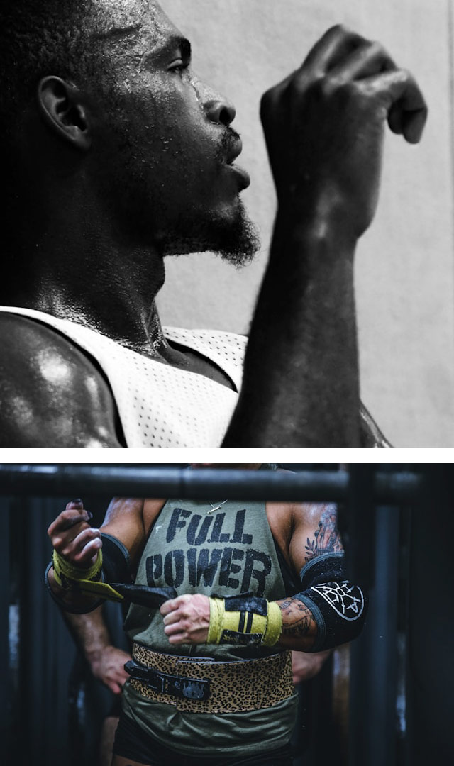
The photographic style is primarily higher contrast greyscale or muted color. Photos should connect to the mission by reinforcing lessons and values. They should have energy and drive with a feel that inspires action and effort.
Details matter and can tell a powerful story. Use lots of closeups & medium shots paired with occasional wide shots and vary shot angles for dynamics.
(*See reference document for explanation of how shot angles communicate)
Maintaining visual consistency helps your audience easily identify and connect with your brand. When you take the time to think through the value and purpose of all your communication materials, you produce much more effective and desireable content that encourages engagement and loyalty.
I also provided a document explaining the basics of layout and cropping, along with tools and guides for checking contrast when overlaying text or other graphical elements.
