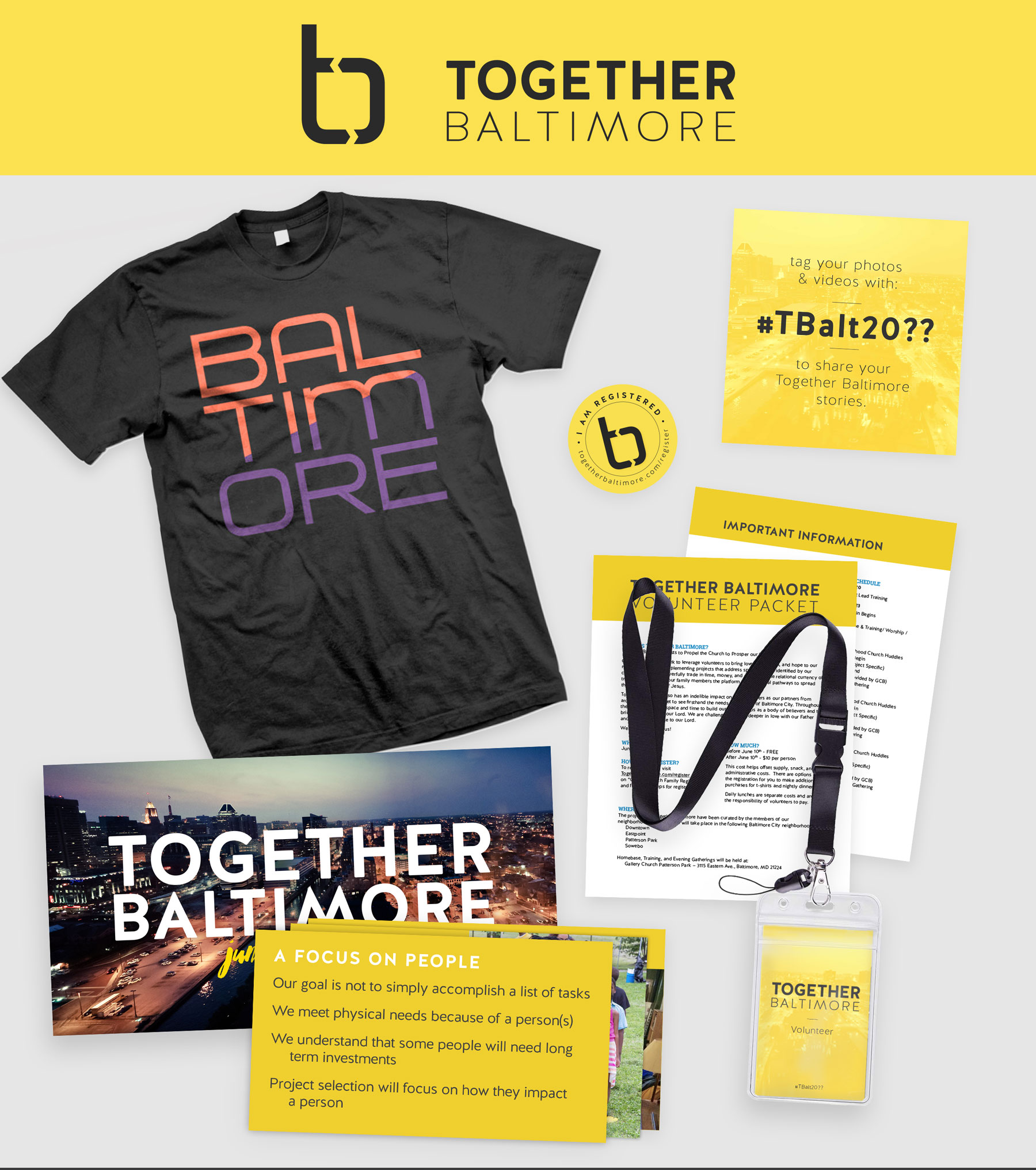
TBalt
A non-profit focused on community improvements and engagement. They were wanting to build out an entire brand identity as they were transitioning from an annual event into an established non-profit. Looking for a logo and branding that would connect to Baltimore and help communicate their mission of coming together to prosper the city.
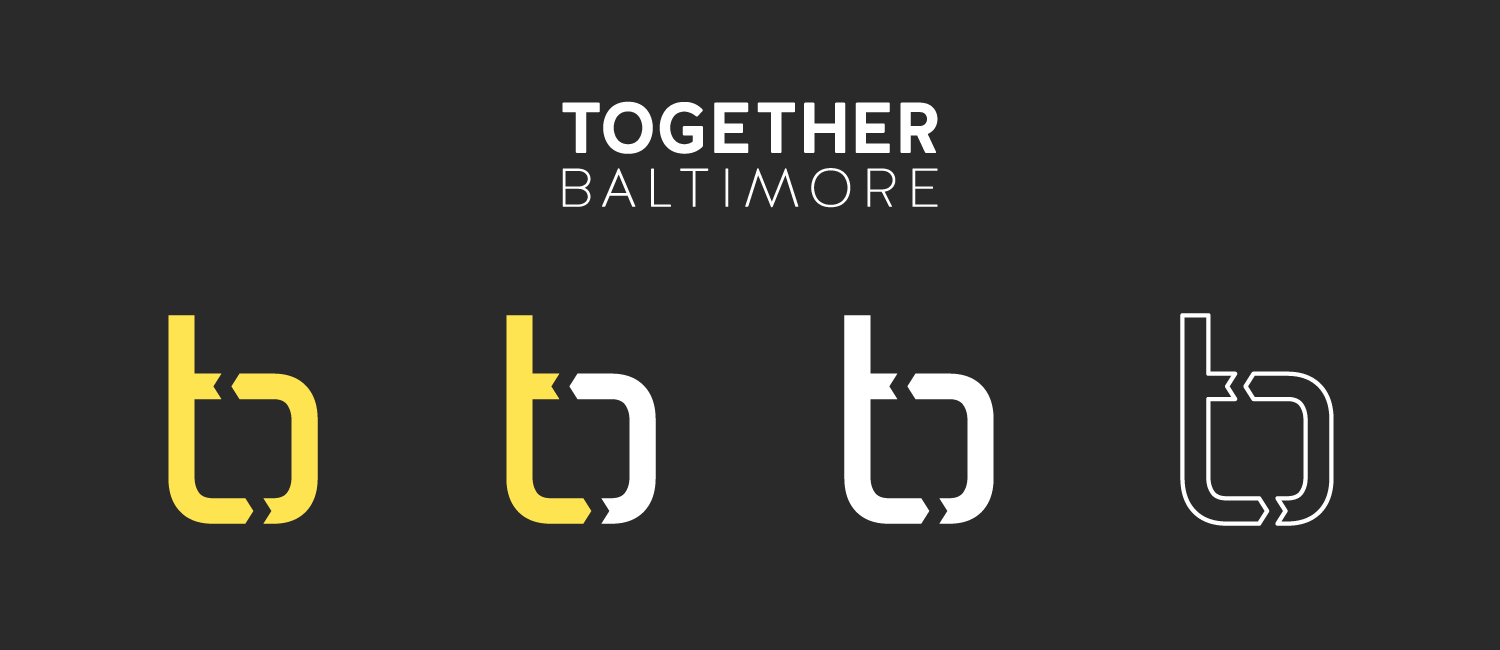
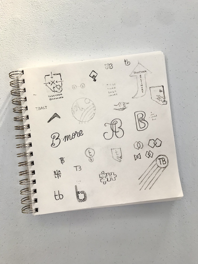
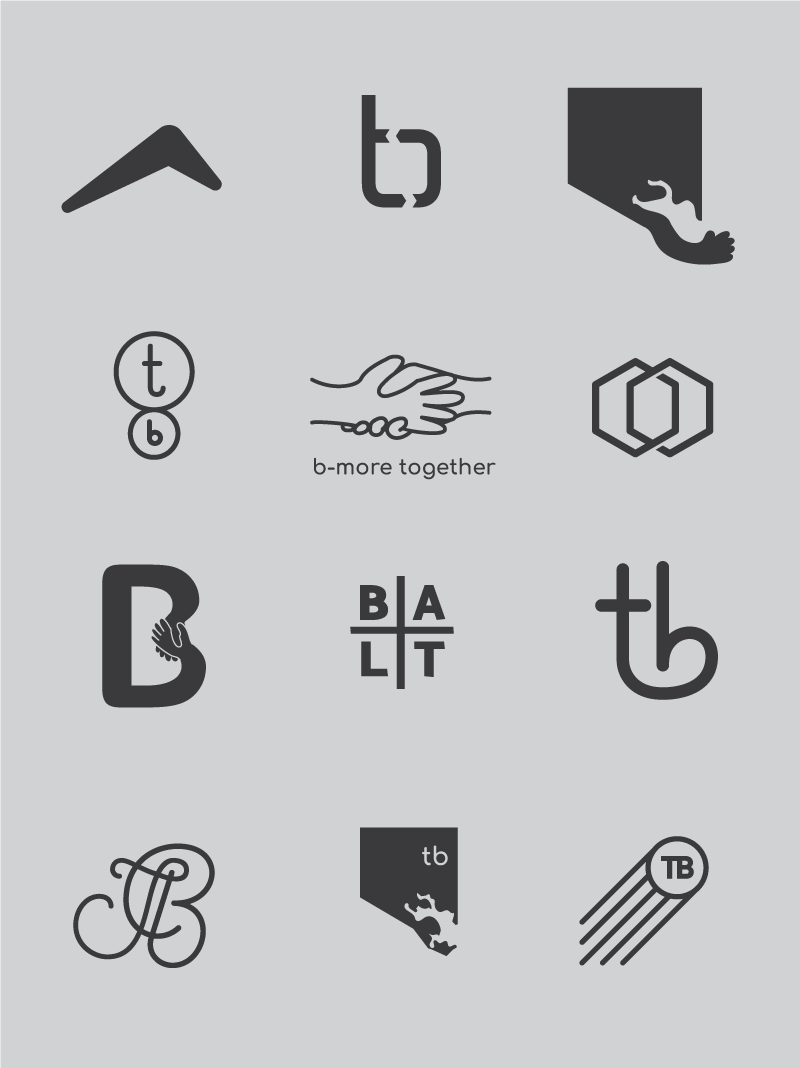
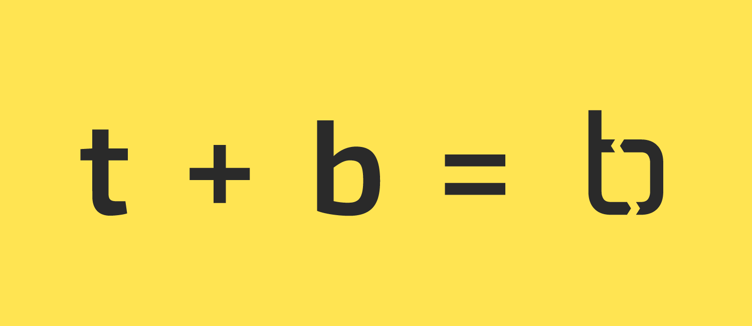
The goal was to incorporate the themes of unity and connection. We worked through a variety of wordmarks, illustrations and icons. Their leadership loved the mashup of the t + b and felt the cyclical element of the arrows helped to reinforce thier mission of empowering the community to care for each other and prosper the city.
Once we had the Logo and brand guide worked out, I put together templates for social media, presentations, and materials for their upcoming event.
